Introduction
The purpose of our second assignment was to upload the data we collected during the first exercise into ArcGIS and manipulate that in a way that would show a 3-D view of our sandbox terrain. Together, these two assignments will give us an idea (on a smaller scale) of the processes that scientists go through to get land data into a digital format. It will also hone our problem solving, teamwork, and spatial thinking skills.Methods
 |
| Figure 1 - Excel data brought into ArcMap |
This created dots in a rectangular shape (Figure 1). These were where we took our measurements, complete with the coordinate system we had created, with elevation data for each dot.
 |
| Figure 2 - IDW raster |
The first technique that I tried was IDW (Inverse Distance Weighted) interpolation. This type of interpolation uses Tobler's First Law of Geography as its basic assumption: things that are close together spatially are more alike than things farther away. When the tool is trying to create a continuous raster image from my handful of dots, it will fill in unmeasured areas with values closest to it. The resulting raster is in Figure 2.
 |
| Figure 3 - Kriging raster |
The second one I tried was Kriging. Kriging is based on the statistical relationships between the
measureed points. This technique returned a raster that was less jagged and more smooth that the previous IDW raster. Other than this small difference, they didn't look very different (Figure 3).
 |
| Figure 4 - Spline raster |
 |
| Figure 5 - Natural Neighbor raster |
Luckily, Natural Neighbor interpolation looked quite a bit better than the other methods (Figure 5). I used a different color scheme for this one to show differences in elevation a little better. You can even see where the bottom of our valley is deepest, which didn't show up in the other methods. In other methods, the valley looked as though it was one uniform depth throughout the entire feature. With the Natural Neighbor method, however, you can see the valley walls and see that it wasn't simply a vertical cliff on the sides.
 |
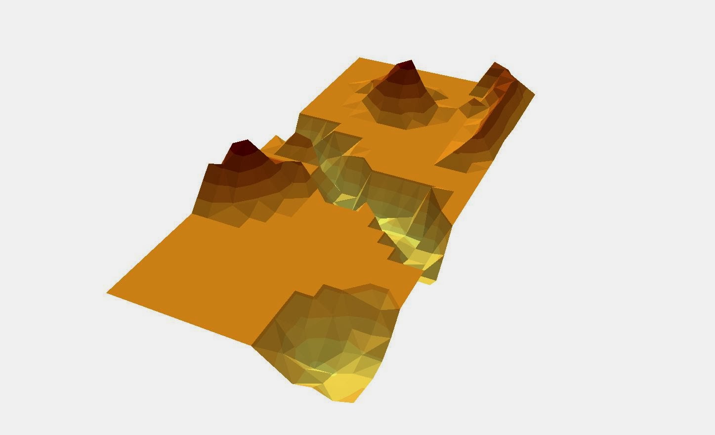
| Figure 6 - TIN of our survey data |
Lastly, I created a TIN (triangulated irregular network) with our data. TINs work by representing the terrain as a system of nonoverlapping triangles. This allows for more detail and a more 3-dimensional look, as edges and peeks can be represented by these triangles. TINs are vector based as opposed to raster, which is how the other methods worked. Figure 6 shows the finished TIN.
 |
| Figure 7 - Survey TIN in ArcScene |
 |
| Figure 8 - 2x vertical exaggeration |
Discussion
Because we did the surveying manually, this project really helped to show how certain types of remote sensing and digital surveying work. Obviously, this was more simplistic and less accurate than using tech, but it was still more accurate that I had thought it would be. I think the project could have went smoother had we been able to do it during a summer month. That way, we could have used sand instead of snow, putting our features deeper into the box, allowing a string grid above our features, making measuring much more simple and accurate.
Conclusion
I understood that higher resolution is more accurate than lower resolution, but this exercise helped show how and why that is. If we had surveyed using smaller increments (like 5 cm or less), the final 3D image would have been much more impressive. I also learned how important critical thinking and problem solving is when working in the field. If an instrument breaks or was left behind, or if weather changes rapidly, we have to be able to work as a team to overcome those issues.
Our team worked quite well together. The project seemed a bit daunting at first, but once we were out there we all had several good ideas on how to proceed. Having a group of five people made it somewhat difficult to find times to meet, as we all have different schedules. The weather was also pretty unforgiving during the last two weeks. No matter how bundled up we were, the cold got to us all eventually. These were the biggest problems that we faced. During a warmer time of year, I think we could have stayed outside for longer periods of time, and our data would have been more accurate because of it.
No comments:
Post a Comment