Sunday, February 23, 2014

Activity #4: Distance Azimuth Survey

Introduction 

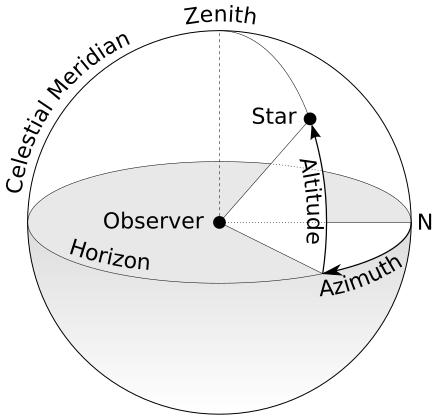
Figure 1 - Visualization of azimuth
This activity was designed to introduce our class to surveying using the distance and azimuth method. This is a fairly simple technique that can be employed when more accurate technology fails or is too expensive. The concept behind this method is simple: locations of features or objects can be accurately recorded and mapped using only slope distance from the surveyor and the azimuth.

Azimuth is an angular measurement of where something is in relation to true north and the observer (Figure 1). For example, north is 0° or 360°, south is 180°, east is 90°, etc. Slope distance is the distance from one point to another along a slope. Think of it as the length of a right triangle's hypotenuse as opposed to the triangle's length (Figure 2). As long as we have accurate coordinate location for where we are standing when taking the readings, we can use slope distance and azimuth to chart anything within range.

Figure 2 - Difference between slope distance and horizontal distance
In today's world, there are other faster and more accurate was of doing surveys, but sometimes that isn't an option. GPS devices rarely work when buildings or other structures obstruct the sky, people forget to charge batteries, equipment can break, weather conditions may restrict what kinds of technology can be used, and on and on. Understanding and knowing how to employ these "low-tech" methods not only comes in handy in a pinch, but also helps us understand how different types of equipment and technology work. After a brief demonstration of the equipment we would be using, we were put into groups and instructed to find an area to survey.

Figure 3 - TruPulse 360 Laser Rangefinder

Methods

Equipment: TruPulse 360 Laser Rangefinder (Figure 3)
The TruPulse rangefinder comes equipped with many functions, but we only need azimuth and slope distance. When looking through the viewfinder, there is a display along the bottom informing the surveyor what measurement is being displayed, and along the top is the actual measurement. On the left side of the device are arrow buttons used to switch modes. "SD" indicated standard distance (in meters) and "AZ" indicated azimuth. On the top of the device is a "fire" button which must be held for a few seconds to get accurate readings. Firing the laser once will collect all the data, so distance and azimuth can be recorded by only firing the laser once per object. 

Magnetic Declination

One issue when finding azimuth is the magnetic declination. This refers to the angular difference between true north (geographical north) and magnetic north (compass needle north as found by using magnetic field lines). If magnetic north lies to the east of true north, it is considered positive declination. The declination is negative if to the west. Some areas can vary drastically, others very little. Before going out into the field, it is always a good idea to check magnetic declination for a study area to ensure measurements are accurate, or can be adjusted for if needed. The magnetic fields of the Earth slowly change over time, and that means magnetic declination does as well.


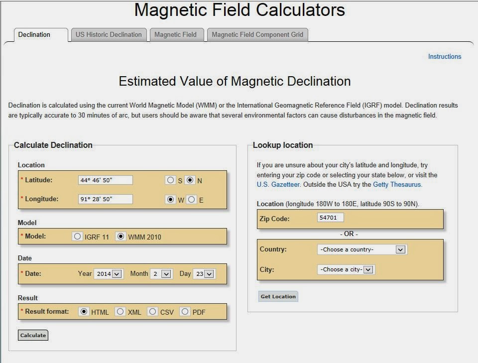
Figure 4 - Enter zip code to find location,
then calculate to get magnetic declination
There are ways to manually find magnetic declination, such as comparing magnetic compass reading to Polaris (North Star), which is within a degree of true north. However, to save time and not have to wait for a clear night, we can also use websites like NOAAs. For this, we simply have to input a zip code to find out the magnetic declination for that area (Figures 4 and 5).

Figure 5 - Magnetic declination results: 1° 4' 53" W


For Eau Claire, we have a magnetic declination of -1° 4' 53". This is a relatively small declination, so we didn't make any adjustments.


Survey Area

Our group wanted to survey an area on campus. In order for this to work, we needed to pick places to survey from that we would easily be able to find accurate coordinates for. Using a GPS device would be too inaccurate. The best thing to do would be to survey from places that would be easily spotted from satellite images (building corners, street corners, etc.), find them on a base map in ESRIs ArcMap, and get the lat/long coordinates from that.


Figure 6 - Red shows areas of campus that are out dated in this
image. Area in blue is the study area we settled on since it was
relatively unchanged.
When we found campus in ArcMap on the aerial imagery base map, we found that the image was very out of date. Campus has changed drastically since the image was taken. In order to get accurate coordinates and have the items we surveyed show up, we needed to pick an area that was mostly unchanged.

In figure 6, I have areas that have completely changed since this image was taken boxed in red. The area in blue is our study area (also in figure 7). This seemed to be a large area that was relatively unchanged that had many features that we could survey.


Figure 7a - Area on Campus to be surveyed. 

Survey
Figure 7b - Locations where we would survey from.

To do the survey, we used three different locations that could be spotted in figure 7 so that we could use ArcMap to find the lat/long coordinates. For each location, we stood in one spot and gathered data from 25 different features. At each location, a different member of our group operated the device while another wrote down the readings that were called out. This way we all got experience using the TruPulse. For each feature, we documented item number, type of feature (bench, light pole, tree, etc.), slope distance, and azimuth (Figure 8).

Figure 8 - Documentation of TruPulse data
  Location #1 is right outside the north entrance to Schofield Hall, at the bottom of the stairs. Location #2 is right in front of the corner of the metal railing at the base of the stairs leading to the foot bridge. Location #3 was on the opposite side of the footbridge, at the corner of the railing at the bottom of the bike ramp. At all locations, we faced inward toward the area directly north of Schofield Hall. Because of this, many features were surveyed from each position but had different distances and azimuths, depending on where it was surveyed from. This way, we would be able to see how accurate our strategy was. Figures 9-12 show the view from each location, as well as many of the features we surveyed.


Figure 9 - Location #1, looking northwest
Figure 10 - Location #1, looking northeast


Figure 11 - Location #2, looking south
Figure 12 - Location #3, looking southeast


Figure 13 - Zach using the TruPulse at location #2

Importing Data

Figure 14 - Excel spreadsheet with our field data ready
to be imported into ArcMap
Figure 15 - Coordinate data displayed in ArcMap
showed Location #1 and Location #2 had the same decimal
degree location
Once we completed our survey, it was time to enter all of the data we wrote down into an Excel spreadsheet that we could import into ArcMap (Figure 14). The table consisted of six fields: Point Number, Distance (m), Azimuth, Point Data (what type of feature it was), X, and Y. The X and Y fields were the longitude and latitude of the three points we collected data from. These coordinates were actually the first problem we encountered during the lab exercise. We planned on using the aerial images from ArcMap to find the coordinates of the points we collected data from. When we finished collecting our data and went to ArcMap, it was not precise enough. The coordinates for Location #1 and Location #2 were the same (Figure 15). If we used those coordinates in our spreadsheet, the data we gathered in the field from Locations #1 and #2 would be displayed from the same point, and would be incorrect. Instead of using those coordinates, I went to Google Earth to collect the coordinate data (Figure 16). The problem here was that Google Earth uses degrees/minutes/seconds for measurement. We needed our data in decimal degrees. Using this website (Figure 17), we converted the Google Earth values to decimal degrees, which gave us much more precise coordinates (six decimal places).


Figure 16 - Google Earth displayed more precise coordinate
locations, but not in decimal degrees


Figure 17 - Website used to convert degrees/minutes/seconds
measurements from Google Earth to decimal degrees

Once the spreadsheet was completed, it was ready to be imported into ArcMap. First, though, we needed to create a geodatabase for all of our data to reside in. A geodatabase is a way to store, organize, and easily access spatial data. To create a new geodatabase, go to Catalog in ArcMap, right click on a folder, and select 'create new file geodatabase.' It was here that all of the data could be saved. To import the Excel table, I right clicked on the new geodatabase in the Catalog and selected 'import --> table (single).' Then I just had to select the sheet (not the whole workbook).

Using the table that I just imported as the input file, I ran the "Bearing Distance To Line" tool. This can be found in the ArcToolbox under 'Data Management Tools' then 'Features' (Figure 18).  This tool used the starting coordinates, the azimuth, and the distance to create a new line feature class (Figure 19).
Figure 18 - Bearing Distance To Line tool in ArcToolbox


Figure 19 - Line feature class created using Bearing Distance To Line tool


Figure 21 - Feature class created with Feature Vertices To
Points tool, as well as the line feature class from figure 19.


 Next I ran the Feature Vertices To Points tool in 'Data Management Tools,' then 'Features' (Figure 20). This tool creates a point feature class at the ends of the line feature class specified, in this case the feature class I created in the last step.

Figure 20 - Feature Vertices To Points tool
Figure 21 - Example of using the Search tab
It is also worth noting that there is an easier way to locate these or other tools. ArcToolbox contains many useful tools, and it can be difficult to remember where all of them are. By clicking on the 'Search' icon on the toolbar, the 'Search' tab is opened. Typing in keywords brings up tools that you might be referring to, as well as where they can be found in ArcToolbox (Figure 21).


Results
Figure 22 - Final results of Bearing Distance To Line tool
over a satellite imagery basemap

 Our survey turned out pretty accurate. Figures 22 and 23 show the results overlaid on a satellite imagery base map, and Figure 24 shows the most notable errors circled in red. The points that we took the survey from look slightly off, meaning all the other points are just slightly off as well. There were a couple of points that were very off. One line ends in the Chippewa River, and two lines are on the library.


Figure 23 -Final results of Feature Vertices To Points tool

Figure 24 - Major errors in final results (circled in red).


Discussion

 Overall, I thought the survey went well. The starting points could be slightly wrong simply because the coordinates we used weren't exact. If we changed the X and Y fields, all the of the data could be improved. Also, I don't know how sensitive the TruPulse is when measuring slope distance. For example, would the reading be very different if the surveyor is pointing at the base of a tree or the middle of a tree? Perhaps it would have been more consistent if only one person used the TruPulse the whole time, as opposed to trading off?

The two points in the library that seem like errors could actually be features that are hidden by the large overhang above the main entrance (like a bench or a garbage can), and so not errors at all. Lastly, the point in the river could simply be human error. The measurement could have been said wrong, written wrong, transferred to Excel wrong, or the button wasn't held down long enough. All of these are possibilities.

 On the plus side, it was a fairly nice day outside. Amiable weather makes taking accurate measurements much easier. In our first lab, I felt that our data collection might have been more accurate had it not been windy and sub-zero. Double-checking becomes less of a priority when you can't feel your fingers. For this lab, however, we could concentrate on the exercise. 

Conclusion

 I can see how this tool would be very useful in the field, though probably not on it's own. It is good to have as a back up, but doesn't seem as accurate as would be needed when working in the field professionally. It is always a good idea to know how to complete a task multiple different ways. When in the field, you can't always count on technology. This method is relatively low-tech and easy, so can be used anytime. Not only have I learned a new skill, but it also helped me to understand a little more about survey techniques. This method is very basic; pick a point that you can confirm is correct, then find where everything else is relative to that point. If your first point is correct, than all the other points should be correct too. Even without a laser rangefinder, this strategy could be put to use in many situations.

Sunday, February 16, 2014

Activity #3: Unmanned Aerial System Mission Planning

Introduction


Unmanned Aerial Systems are used in a variety of scenarios.  In this lab, we have been given five real life scenarios that unmanned aerial systems could be used in.  We are to look at these scenarios and critically think how we would plan our attack by using an unmanned aerial system.  Since these are vague scenarios there are some questions that arise as we are mission planning.  This lab is designed to help familiarize us with one of the most up and coming job markets in technology and to gain knowledge of what kinds of unmanned aerial systems are on the market.

Types of Unmanned Aerial Systems


Multicopters- Multicopter Unmanned Aerial Systems are perfect for tight fit areas like power lines or for a quiet approach.  Multicopters can have two or more wings.  Multicopters are used to fly short times from 10 to 30 minutes in length.  These multicopters can be landed or can take off in a relatively small area.  These are best used in tight spaces, for they can hover, go faster or slower.  Here are examples of flights performed by 
multicopters:

Fixed wing- Fixed wing craft are perfect for mapping large areas. They can reach a higher altitude and stay in the air for a longer period of time compared to multicopters. This makes them perfect for terrain modelling or aerial mapping. A downside is that the do require some space for takeoff and landing, whereas multicopters do
not.

Lighter than air- Lighter than air craft are similar to balloons and blimps. The main area is a section filled with a gas that is lighter than the surrounding air (like helium). Like multicopters, these are capable of taking off and landing vertically, making them very versatile. They are also usually cheaper than the other two. The biggest problem is the lack of control. Any wind would throw a balloon or blimp type craft off course, limiting the situations they could be used it.


Scenarios

Scenario 1
A military testing range is having problems engaging in conducting its training exercises due to the presence of desert tortoises. They currently spend millions of dollars doing ground based surveys to find their burrows. They want to know if you, as the geographer can find a better solution with UAS.

Questions before Starting:
  • How big is the survey area?
  • What time of year will the survey be done?
  • Where do desert tortoises burrow?
  • When are desert tortoises most active?
 
For example, desert tortoises are most active during the morning and evening hours of the spring, when the desert air is coolest (they hibernate during the winter). Locating tortoises on the military testing range would be easiest during these times, as they would be out of their burrows looking for food.

One way of locating the creatures would be to use a gas-powered, fixed wing UAV equipped with a thermal imaging sensor and a video camera. A fixed wing craft would be able to cover more area faster than most rotary craft, and using a gas engine as opposed to an electric would enable the craft to stay in the air longer. Thermal sensors would pick up heat given off by the tortoise while it is outside of its burrow.

One problem that might arise is if the tortoise shell warms from the heat of the desert sun, therefore blending in with the surrounding rocks on a thermal imaging sensor. This is why the time of day would be very important, and the thermal camera would be supplemented with a normal video camera.

The survey area could be cut down by focusing on areas near some kind of vegetation. The animals burrows would have to be somewhat near an area where they could get food, since they do not move very quickly. Beginning the search in this area would be a good start.

When tortoises are spotted, the technician could plot a point using a GIS program, or the UAS flight software. When the craft has finished its flight, we could send out a truck equipped with gear for collecting tortoises to those locations marked, and relocate the animals. Tortoises would not have moved far from the position they were in when the UAS spotted them.

Scenario 2
A power line company spends lots of money on a helicopter company monitoring and fixing problems on their line. One of the biggest costs is the helicopter having to fly up to these things just to see if there is a problem with the tower. Another issue is the cost of just figuring how to get to the things from the closest airport.

Questions before Starting:
  • How tall are the power lines?
  • How far is it between the towers?
  • How many miles of power line are we looking at? 2 miles or 30 miles?
  • What is the weather like?
 
If the weather is bad, for example if there is any wind or precipitation, the unmanned aerial system will have a harder time operating and not running into a power line.  

Since we don’t know how far we have to plan for, it would be best to imagine that we need to look at a long stretch of power line.  With a long stretch of power line we will need an unmanned aerial system that can fly for a long time.  Gas powered or dual battery UAS systems will be our best bet because it will allow us to view greater amounts of power line and help save the electric company money.  With power lines being close together, we will need a small, versatile UAS system that has a video camera with the option to take pictures.  I think being able to fly the UAS down the power line with a video/still camera would be our best option.  When flying down the power line if you notice a problem you could take a still picture and see what equipment you would need to fix the problem.  There are many UAS available, but the best one for this job would look like the 3DR RTF X8 with a GoPro camera attached.  You can check out this UAS by clicking here and the camera here.
Here is an example of a power line tower that was surveyed by a UAS.
Scenario 3
A pineapple plantation has about 8000 acres, and they want you to give them an idea of where they have vegetation that is not healthy, as well as help them out with when might be a good time to harvest.

Pineapple plantation
Questions before Starting:
  • What time of year is it?
  • Harvest or growing season?
  • Is there a history of problems (like parasites, bacteria, fungus, etc.) on this plantation?

For a situation like this, the best thing to do would be to start with the most recent NDVI (normalized difference vegetation index) satellite data of the area. The plantation is too large to start combing the entire area with a small, unmanned craft. Using recent NDVI satellite data, we could see what areas are not as healthy. Then, once we have narrowed down our survey area, we could send out a UAS to gather data on those specific parts of the plantation. With video and infrared devices on board, we could find out why those areas are having trouble (if it is a soil issue, pest issue, etc), and plan accordingly.

Example of NDVI data
Another, cheaper option would be to use a balloon after analyzing the NDVI data. The same type of multispectral cameras could be fitted to a balloon to get images from above the plantation. The problem with this option is that you wouldn't have as much control over a balloon as you would a fixed wing or rotary device.

A gas powered fixed wing craft may be the best option, as it would be able to cover more area and remain in the air for longer periods of time, as compared to a rotary craft. After analysing the satellite images and narrowing down the area, we could send out a fixed wing craft that would circle the areas in question and gather multispectral data. Here is a company that is doing this exact thing right now.

Scenario 4
An oil pipeline running through the Niger River delta is showing some signs of leaking. This is impacting both agriculture and loss of revenue to the company.

Niger River Delta
Questions before Starting:
  • How many miles of pipeline do we have to monitor?
  • How much oil they are losing from the leaking?

There are more ways to start like remotely sensed or LIDAR images. The first, but most expensive option would be to use LIDAR data. LIDAR data are images have a closer resolution, have more depth and detail than remote sensing images from LandSat or other satellites. A good, cheap way would be to use the latest NDVI (normalized difference vegetation index) or LandSat image of the area to see where vegetation is dying or where a leak might be. If the pipeline is in two or more images you can mosaic the images together to be able to look at the full pipeline. In order to use an UAS for this situation we would have to use a very quiet and undetectable system. Niger has been through a lot of changes in the past few decades which has led to violent outbreaks. You can read about Niger and it’s history here.  

Scenario 5
A mining company wants to get a better idea of the volume they remove each week. They don’t have the money for LiDAR, but want to engage in 3D analysis (Hint: look up point cloud)

Questions before Starting:
  • How large is the mine?
  • How in depth does the photo have to be?

Since they don’t have the money for LiDar they could use DroneMapper to create 3D landscape images.  DroneMapper software can create 3D images from 2D aerial photos. We could send up a UAV to take still images of the mining site at the end of each week for the mining company. Those still images could then be sent in to DroneMapper for the conversion. Another way would be to have a balloon with a camera mounted on it take the pictures. An advantage of using a balloon instead of a UAV would be that it would cut down further on cost. Further information about the DroneMapper service can be found here and information about their image requirements can be found here.


Saturday, February 8, 2014

Activity #2: Digitally Representing Survey Data

Introduction

The purpose of our second assignment was to upload the data we collected during the first exercise into ArcGIS and manipulate that in a way that would show a 3-D view of our sandbox terrain. Together, these two assignments will give us an idea (on a smaller scale) of the processes that scientists go through to get land data into a digital format. It will also hone our problem solving, teamwork, and spatial thinking skills.

Methods

Figure 1 - Excel data brought into ArcMap
I started this assignment with the data that we had collected and organized during the previous lab. I first started with ArcMap 10.2 to bring in the Excel spreadsheet. With the spreadsheet loaded, I had to right click it in the table of contents and select 'Display XY Data' before I would be able to make a shapefile. When the 'Display XY Data' window opened, I made sure to select 'z' from the 'Zfield' drop-down menu, otherwise the points would have no elevation data.

This created dots in a rectangular shape (Figure 1). These were where we took our measurements, complete with the coordinate system we had created, with elevation data for each dot.


Figure 2 - IDW raster
It took some searching, as I hadn't used ArcMap in a few months (and hadn't done this process in quite a bit longer), but I eventually found the tools to use. Under 3D Analyst Tools in the ArcToolbox I found Raster Interpolation. This included several different tools for creating a continuous raster image from my system of points with elevation values.


The first technique that I tried was IDW (Inverse Distance Weighted) interpolation. This type of interpolation uses Tobler's First Law of Geography as its basic assumption: things that are close together spatially are more alike than things farther away. When the tool is trying to create a continuous raster image from my handful of dots, it will fill in unmeasured areas with values closest to it. The resulting raster is in Figure 2.


Figure 3 - Kriging raster
The tool was simple and worked on the first try. The image did look very much like our sandbox terrain (though mirrored over a horizontal axis for some reason). I had hoped, however, the quality would be better when using different techniques.

The second one I tried was Kriging. Kriging is based on the statistical relationships between the 
measureed points. This technique returned a raster that was less jagged and more smooth that the previous IDW raster. Other than this small difference, they didn't look very different (Figure 3).


Figure 4 - Spline raster
Spline is a type of interpolation method that generates values using a function that reduces surface curvature. This tool is found in the same toolbox as the other two. Again, this raster did not look exceptionally different than the other rasters I had already generated. At this point, I started to worry that my data was not detailed enough.


Figure 5 - Natural Neighbor raster

Luckily, Natural Neighbor interpolation looked quite a bit better than the other methods (Figure 5). I used a different color scheme for this one to show differences in elevation a little better. You can even see where the bottom of our valley is deepest, which didn't show up in the other methods. In other methods, the valley looked as though it was one uniform depth throughout the entire feature. With the Natural Neighbor method, however, you can see the valley walls and see that it wasn't simply a vertical cliff on the sides.


Figure 6 - TIN of our survey data


Lastly, I created a TIN (triangulated irregular network) with our data. TINs work by representing the terrain as a system of nonoverlapping triangles. This allows for more detail and a more 3-dimensional look, as edges and peeks can be represented by these triangles. TINs are vector based as opposed to raster, which is how the other methods worked. Figure 6 shows the finished TIN.


Figure 7 - Survey TIN in ArcScene
Once this was done, I brought the TIN into ArcScene to get a 3D image of our terrain. Figure 7 shows the finished product with a desert-like color scheme. Figure 8 is the same TIN, but I added a x2 exaggeration to the elevation data so that differences in elevation could be seen better.

Figure 8 - 2x vertical exaggeration


Discussion

Because we did the surveying manually, this project really helped to show how certain types of remote sensing and digital surveying work. Obviously, this was more simplistic and less accurate than using tech, but it was still more accurate that I had thought it would be. I think the project could have went smoother had we been able to do it during a summer month. That way, we could have used sand instead of snow, putting our features deeper into the box, allowing a string grid above our features, making measuring much more simple and accurate. 

Conclusion

I understood that higher resolution is more accurate than lower resolution, but this exercise helped show how and why that is. If we had surveyed using smaller increments (like 5 cm or less), the final 3D image would have been much more impressive. I also learned how important critical thinking and problem solving is when working in the field. If an instrument breaks or was left behind, or if weather changes rapidly, we have to be able to work as a team to overcome those issues. 

Our team worked quite well together. The project seemed a bit daunting at first, but once we were out there we all had several good ideas on how to proceed. Having a group of five people made it somewhat difficult to find times to meet, as we all have different schedules. The weather was also pretty unforgiving during the last two weeks. No matter how bundled up we were, the cold got to us all eventually. These were the biggest problems that we faced. During a warmer time of year, I think we could have stayed outside for longer periods of time, and our data would have been more accurate because of it.

Thursday, February 6, 2014

Activity #1: Terrain Survey

Introduction


This activity had several objectives. Not only were groups tasked with creating and surveying terrain  in sand/snow boxes, which would introduce students to bringing real world data into a computer without the use of digital tools, but also forced students to use critical thinking strategies to accomplish the assignment. Students were given little direction on how to do build and survey the locations, so working together with groups was key to finding the best way to manually survey the locations.

Methods


The activity called for groups of five to build a terrain that included a ridge, hill, depression, valley and a plain in the planter boxes located in the Phillips Hall courtyard on the University of Wisconsin- Eau Claire campus. We had access to meter sticks and tape measures, as well as any other equipment we had ourselves.

It was originally difficult to find a time to meet, due to schedules and sub-zero weather. Much of the week had a wind chill advisory for our area. The first day we were going to meet ended up snowing heavily, so we postponed until Saturday.

First, we decided that we would set "sea-level" at where the frozen dirt was (beneath the snow), and build our terrain on top of that. After excavating the snow, however, we found that the dirt underneath was not at all level (Figure 1). Instead, we decided to set our temporary "sea-level" at the rim of the box. This would mean that the depressions and valleys would get negative values, but we would be able to set "sea-level" to any point below our lowest point later, allowing us to use only positive values when importing data into ArcGIS.

Figure 1 - Non-level initial sea-level
 Once that was decided, we filled the box back in with snow and leveled it off. From there, we built the terrain. The valley we carved into the snow meandering across the box. We put in a ridge in one of the corners, a depression in a different corner, and two hills on opposite sides of the valley. We left one corner open as a plain (Figure 2).
Figure 2 - Finished terrain


Figure 3 - Measuring and marking our grid
Once the terrain was sculpted, we needed to decide on a coordinate system. We settled on grids that were 8x8cm. This was because the x-axis (the shorter end of the rectangle) was divisible by 8 (112cm). The y-axis could not divide by 8, but we simply ignored the last row of half squares. In the end, our coordinate system ended up being a 29x14 grid of 8x8cm squares. We measured the distances and marked them on the wooden frame of the box (Figure 3).
Next came the difficult part. We had to figure out how to survey the features. With us, we had two meter sticks, string, pencils and pens, thumb tacks, and a notebook. The biggest problem we encountered was that our features were built higher than the rim of the box. This meant that putting anything level across the box to form the grid would ruin our terrain.
Figure 4 - Setting up string grid

Our original idea (when we were still planning on using the dirt as the base ground level) was to have a grid of string stretched over our features, who's highest peak would not have passed the top of the box. This obviously wouldn't work.

We settled on allowing the string to lay on the terrain, following the curves (except of the deep valley, which the string bridged across). Figure 4 shows process of setting up the string and figure 5 is the finished product.


Figure 5 - Finished sting grid
To survey, we used the meter sticks and measured (in cm) the highest point of every square. Many of the squares had no positive or negative elevations, and so we didn't need to measure. I didn't get any pictures during this portion of the exercise because we were all active at the time. After being out in the frigid weather for several hours, we wanted to finish as quickly as possible.


Figure 7 - Data organized in a way that could be
imported into ArcGIS
Once we collated our data into excel, we could visually get an idea of how it would look (Figure 6). The problem was that having the data organized like this was pretty much useless. Instead, we needed a table that had the x,y, and z values in separate columns (Figure 7).


Figure 6 - Original raw data


Figure 8 - Survey data
with all values
increased by 12.
The last thing we wanted to do before bringing our data into ArcGIS was to change where sea-level was. We thought it would be easier to deal with the data if we did not have to worry about negative numbers. To change this, we simply added 12cm (our lowest measurement was -11cm) to all measurements. Our "sea-level" was 12cm below the edge of the box. Figure 8 shows this transformation. In the 'z' column, anything that shows '12' was actually level with the sandbox rim.


Discussion

Critical thinking and teamwork were very important during this exercise. From looking through the blogs from last semester, we had a general idea of what and how to accomplish the goals. But this still left a lot of wiggle room. We encountered several issues and problems (only one of which was the unforgiving cold), but working together we were able to gather our data.

In the next post, I will be uploading this data to ArcGIS and trying to create a 3-dimensional image of our terrain. Hopefully our survey method worked well enough.

Conclusion

This lab did a good job of not only getting us used to thinking critically and do some problem solving, but also forced us to think spatially. It seemed like after every step, there seemed to be some little problem in our way. We would brainstorm and decide the best solution. This even included the best way to write down numbers while keeping fingers warm. I'm looking forward to completing the next lab and see how accurate our data ended up being.